Data Visualization Dashboards
Get a clear view of your agency.
Integrate data from all facets of your agency into cohesive dashboards and reports. Act on what matters most.

Trusted by federal agencies and leading primary contractors.
Data Visualization Services We Provide
1. Data Visualization Services
Data visualization creates compelling representations of complex data, offering federal agencies a clear and intuitive way to interpret information. In today’s information-rich environment, effective data visualization is paramount for communicating insights, detecting patterns, and making educated decisions.
Our data visualization services empower you to transform raw data into actionable visual narratives, enhancing your ability to understand trends and communicate complex information across various stakeholders.
2. Custom Dashboard Development
Operational dashboards allow your team to consolidate and visualize key performance indicators and metrics in a centralized platform. Custom dashboards play a pivotal role in providing a real-time, at-a-glance view of critical data, enabling data-driven decision-making.
Our experienced developers leverage a range of advanced tools and technologies to deliver high-quality custom dashboards with tools like Tableau, Microsoft Power BI, and Google Data Studio. Integrating data sources is seamlessly handled through technologies like SQL databases, RESTful APIs, and cloud-based solutions like AWS or Azure.
3. Dashboard & Report Optimization
Optimizing dashboards and interactive reports is crucial for agencies seeking to streamline information consumption, monitor business processes, improve user experience, and derive maximum value from data visualization platforms. We focus on refining existing dashboards and reports to ensure they align with mission objectives, presenting information in an insightful and user-friendly manner.
We use advanced tools like Google Data Studio, Power BI, and Tableau for dashboard and report optimization to refine visualization elements, improve data processing speed, and enhance overall performance.
4. Data Preparation
5. Data Platform Development
Create scalable platforms to collect, store, process, and analyze large volumes of data. In today’s data-driven landscape, having a well-designed data platform is crucial for agencies seeking to harness valuable insights for informed decision-making.
We use database management systems such as MongoDB, MySQL, and Oracle for efficient data storage and retrieval. Apache Hadoop and Spark also allow for big data processing. Our development teams incorporate technologies like Apache Kafka for data streaming and Apache Flink for real-time analytics.
6. Custom BI Implementations
Custom business intelligence implementations are essential for harnessing the full potential of your data—from collection and analysis to visualization. Our services in this domain are instrumental in helping your agency transform raw data into actionable intelligence.
Our developers use BI tools like Tableau, Microsoft Power BI, and Qlik and integrate with diverse data sources through SQL databases, RESTful APIs, and cloud platforms like AWS or Azure. Our approach encompasses the entire BI lifecycle, from data extraction and transformation to visualization and reporting.
Case study

Analytics Logic was enlisted to enhance the data visualization capabilities for the U.S. Department of Health and Human Services. The challenge was to develop an advanced dashboard infrastructure that not only presented data more coherently but also supported deeper analytical insights into customer experiences and site performance. Read the full case study.
Key Facts about Data Visualization and Reporting
- Unify Complex, Siloed Information Bring together complex, siloed information into a single, unified view. This allows agencies to see comprehensive operational insights across different departments and make impactful decisions.
Faster Interpretation of Data Convert data into visual formats for quicker analysis and understanding of patterns and insights. This saves time and resources, enabling agencies to make informed decisions swiftly.
Identify Patterns and Relationships Graphic representations of complex datasets help uncover relationships and patterns between various factors. This is crucial for revealing hidden insights and making data-driven decisions.
Track Emerging Trends Identify and act on emerging trends to stay ahead of potential opportunities and challenges. Data visualization allows agencies to predict trends based on real-time reports, enhancing strategic planning.
Tell a Compelling Data Story Transform raw data into engaging visual stories that inform stakeholders at all levels. This makes it easier to present highly actionable insights in an interactive and captivating manner.
Utilize Interactive Dashboards Interactive dashboards provide real-time insights, empowering agencies to make impactful decisions quickly. These dashboards consolidate all reports and insights in one place, enabling easy access to critical KPIs.
Set Up Custom Alerts for Critical Actions Create custom alerts and dynamic thresholds to notify you of critical events. This proactive approach ensures timely responses to important triggers.
Drive Organization-Wide Behavior with Scorecards Standardize performance criteria through visual scorecards, driving organizational change from the bottom up. Ensure that everyone in the agency aligns with strategic goals and objectives.
By leveraging data visualization, federal agencies can enhance data interpretation, streamline decision-making processes, and ultimately improve their overall mission performance.
Government Website Analytics Visualize website performance measured by the GSA’s Digital Analytics Program (DAP), user behavior, and engagement metrics, ensuring that government websites effectively serve the public.
Social Media Insights Visualize social media performance data to understand engagement levels, track sentiment, and measure the impact of social media campaigns.
- Voice of Consumer Data: Collect and visualize Voice of Consumer data through tools like Qualtrics or Medallia to gain insights into public feedback, improve service delivery, and drive citizen-centric initiatives.
Organic Search Performance Analyze and visualize organic search data to optimize content strategies, improve search engine rankings, and increase online visibility.
Mobile App Performance Monitor and visualize mobile app performance metrics to enhance user experience, track engagement, and identify areas for improvement.
Operational Efficiency Visual dashboards can monitor and improve operational processes in real-time, helping agencies streamline workflows and enhance productivity.
Policy Analysis Data visualization allows policymakers to analyze the impacts of different policy scenarios, identify trends, and make evidence-based decisions.
Performance Monitoring Track the performance of various programs and initiatives through visual scorecards and dashboards, ensuring that strategic goals are met effectively.
Resource Allocation Visual tools can help agencies optimize resource allocation by providing clear insights into budget usage, staffing levels, and other critical resources.
Public Health Surveillance Visual analytics are essential for monitoring public health data, identifying outbreaks, and responding to health emergencies swiftly.
Compliance and Reporting Use data visualization to ensure compliance with regulatory requirements by clearly presenting necessary data and facilitating transparent reporting.
Stakeholder Engagement Engage stakeholders by presenting complex data in an understandable and visually appealing manner, enhancing transparency and trust.
Emergency Response Visual tools are crucial for real-time monitoring and response during emergencies, helping agencies coordinate efforts and allocate resources effectively.
Fraud Detection Identify and mitigate fraudulent activities through pattern recognition and anomaly detection in visual data representations.
Training and Development Use visual data to assess training needs, track progress, and measure the effectiveness of development programs.
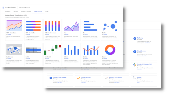
- Area Charts: Show cumulative totals over time.
- Bar Charts: Compare different categories or groups.
- Box-and-Whisker Plots: Summarize data distribution.
- Bubble Charts: Represent data with varying bubble sizes.
- Bullet Graphs: Compare performance against benchmarks.
- Candlestick Charts: Track financial market data.
- Choropleth Maps: Show data by geographical regions.
- Dot Plots: Highlight individual data points.
- Funnel Charts: Represent stages in a process.
- Gantt Charts: Plan and track project timelines.
- Gauge Charts: Show performance within a range.
- Geospatial Maps: Visualize spatial data on maps.
- Heat Maps: Highlight areas with high or low values.
- Histograms: Show frequency distributions.
- Line Charts: Track changes over time.
- Mosaic Plots: Visualize categorical data relationships.
- Network Diagrams: Show relationships between entities.
- Pie Charts: Show parts of a whole.
- Radial Charts: Display data in a circular format.
- Sankey Diagrams: Illustrate flow and connections.
- Scatter Plots: Display relationships between variables.
- Spider Charts: Compare multiple variables.
- Treemaps: Visualize hierarchical data.
- Tree Diagrams: Display hierarchical data in tree structures.
- Violin Plots: Combine box plots and density plots.
- Waterfall Charts: Track cumulative changes.
- Word Clouds: Visualize the frequency of words.
- 3D Charts: Represent data in three dimensions.
100s of federal offices, staff divisions, and contracting companies rely on our Data Visualization services.
Why Choose Analytics Logic for Data Visualization and Reporting Services

Deep Federal Experience
Benefit from our 12+ years of experience with U.S. Federal projects, ensuring compliance and deep understanding of governmental data needs and challenges.
Strategic Tech Partnerships
Leverage our vendor-neutral partnerships with top tech giants like Google, AWS, Azure, and more, allowing us to tailor cutting-edge data science solutions perfectly suited to your requirements.
Diverse Industry Insight
Our team of dedicated data experts brings invaluable cross-industry experience from government, healthcare, finance, and media, enabling us to cross-pollinate best practices across industries, providing you with innovative, tried-and-tested solutions that are not confined to a single perspective.
Our streamlined and effective process.

Step 1
Initiate discovery.
Step 2
Tailor solutions.
Step 3
Launch and execute.
Frequently Asked Questions (FAQ)
Data visualization is the graphical representation of information and data. By using visual elements like charts, graphs, maps, and other visual formats, data visualization tools provide an accessible way to see and understand trends, outliers, and patterns in data. The primary goal of data visualization is to make complex data more understandable, actionable, and usable for decision-making.
In the context of federal agencies, data visualization can transform raw data into meaningful insights that drive mission success and improve public service delivery. For instance, it can help in monitoring the performance of various government programs, analyzing demographic data to allocate resources more efficiently, or tracking the effectiveness of public health initiatives.
Effective data visualization goes beyond just presenting data; it involves a thoughtful process of designing visual representations that convey the right message to the intended audience. This includes selecting the appropriate type of visualization (e.g., bar charts for comparisons, line charts for trends over time, heat maps for geographical data), ensuring clarity and accuracy, and making the visuals interactive and engaging.
By integrating data from multiple sources and presenting it in a unified, visually appealing manner, data visualization enables federal agencies to quickly identify trends, make informed decisions, and communicate insights effectively to stakeholders at all levels. It also enhances transparency and accountability by making data more accessible and understandable to the public.
Looking for reliable machine learning expertise for your agency?
See how we can help.