Introduction
Project Context: Analytics Logic was enlisted to enhance the data visualization capabilities for the U.S. Department of Health and Human Services (HHS). The challenge was to develop an advanced dashboard infrastructure that not only presented data more coherently but also supported deeper analytical insights into customer experiences and site performance.
Challenges
Identify Key Challenges: The ASPA division of HHS faced several obstacles with their existing data visualization systems:
- Difficulty in interpreting complex customer experience data from raw numbers.
- Lack of efficient tools for organizing and analyzing data, which hindered data-driven decision-making.
- Existing dashboards were outdated, leading to potential misinterpretations and unreliable insights.
Solutions
Solution Implementation: To address these challenges, Analytics Logic implemented a robust solution involving several advanced tools and techniques:
- Developed interactive dashboards using Business Intelligence tools like Tableau and Google Looker.
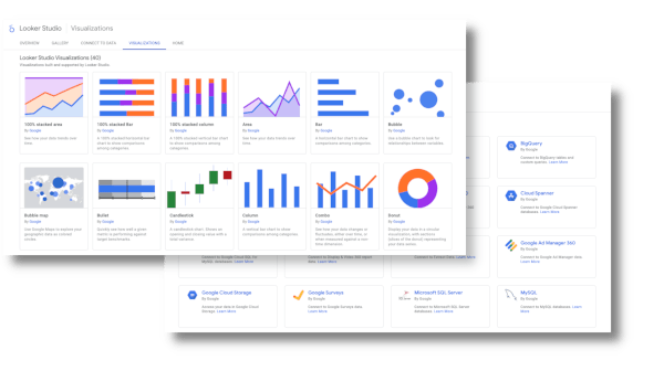
- Integrated a variety of visualizations such as bar charts, whisker plots, bubble charts, and more to depict complex datasets clearly.
- Included dynamic filters and controls to allow users to customize their data exploration, enhancing the interactive analysis of trends and KPIs.
Team Expertise: The project was spearheaded by a dedicated team of data scientists and visualization experts skilled in Tableau, RStudio, and Python, ensuring a tailored approach to dashboard development.
Services Rendered
- Development of interactive and dynamic dashboards,
- Custom visualization implementation including heatmaps, histograms, and line graphs,
- Data organization and analysis using Tableau Prep, Tableau and Looker,
- Continuous maintenance and update of dashboards,
- Training sessions for HHS staff on dashboard utilization and data interpretation.
Results
Measurable Outcomes:
- Enhanced user understanding of website analytics, user experience, and online trends through sophisticated visualizations.
- Streamlined decision-making processes with accessible and actionable insights derived from complex data sets.
Client Benefits:
- HHS staff can now leverage fully interactive dashboards to make informed decisions based on comprehensive data analysis.
- Reduced risk of data misinterpretation with up-to-date and well-maintained dashboard systems.
Conclusion
Summary of Success: Analytics Logic’s deployment of advanced dashboards has significantly transformed data visualization practices at HHS, facilitating a more intuitive and analytical approach to data-driven decision-making.

